The Making of a Great Show Page
A really good show page gives customers all the relevant information they need, plus encourages them to buy with videos and reviews. Everything your customer needs is there, clearly laid out, making their buying decision easy and straightforward.
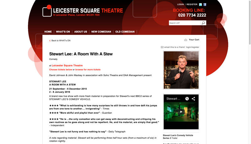
Let’s take a look a fantastic example of a really effective show page from Leicester Square Theatre.

Breaking Down a Show Page That Drives Conversions
As an overall impression the Leicester Square Theatre show page is clean and focused. There are relevant reviews, clear dates and a clear way to buy tickets. The images and video are also a great addition, allowing potential customers the chance to get a fell for the show.
Booking Fees
Booking fees are really unnecessary. Customers hate them, and even if they do pay them, the idea of a fee in the customer's’ mind can be really damaging to your brand. Avoid fees if you can, and implement a donation options instead.
Exclusive Access
Give your members or friends exclusive access to shows before anyone else. Members are more likely to purchase in advance online when given perks and added extras.
Online Discounts
With Ticketsolve you can add exclusive online discounts to specific shows or events. These discounts can be automatic, for example, when a customer buys for two specific shows together, the cart will automatically be discounted by 20%. Or discounts can be redeemed using a discount code. If you are going to add discounts, be sure you state that they are only available online, and for a limited amount of time. This will create a sense of urgency, as well as drive your customers to buy online.
Ask your customers
After your customers have purchased their tickets make sure you ask them what they thought about the online process. Send them a quick survey they can complete or speak to them when they arrive at the venue. Those are just a few tweaks you can make to boost your ecommerce conversion rates.
There's lots more you can do: A/B testing, Custom Landing Pages, Facebook & Twitter adverts targeting custom audiences - check out our other blogs for ideas.
Be Mobile Driven: Responsive Design

Thus far we have been talking exclusively about e-commerce. But if you are not focused on "m-commerce" you are missing a trick.
A recent Actinic study revealed that data from 2,100 European companies confirms that mobile is already a key sales channel.
What’s more is the speed with which this channel is growing. More than a quarter of digital sales are now conducted via smartphone or other mobile device.
You might think this trend is really just a Gen Z thing, but older customer groups are readily embracing mobile purchasing as well - especially those groups with spending power.
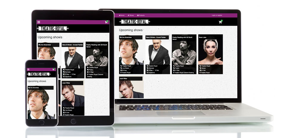
Even if your target audience isn’t finalising their purchase on a mobile device, chances are they are visiting your site on a mobile device to see what you have on offer. This is why you need to make sure that your website is responsive. A responsive design website, looks and behaves the same across any platform, any browser and any device. From a user’s perspective, the site looks exactly the same, and allows them to interact with the site in the same way whether on a laptop/desktop or their mobile.
If your site is not responsive you may lose sales, plus Google will not be happy! Luckily Ticketsolve’s online platform is fully responsive so no matter what device your customers are using, they will get the same buying experience which in turn should increase mobile and tablet sales.
If you want to learn more about our responsive platform, or how to increase those all important conversions - get in touch!
And don't forget to sign up for The Future Now AMA Digital Marketing Day (Glasgow and London) on the 5th of December - we'll see you there!

