There is no denying the visual power of Instagram. In one perfect platform, you can visually share exactly what your arts organisation is all about. Of course, you can just throw your photos up with a filter and a few (hundred) hashtags - or you can get creative with fine-tuned visuals that stop your audiences dead in their tracks. If you are reading this, we're guessing you are after a drool-worthy Instagram feed!
Who is Instagram for?
You might be thinking that your audience lives on Facebook or Twitter or somewhere else. And while that may be true for a certain demographic, more and more people are spending their time on Instagram. And if you are serious about developing the next generation of patrons then a forward-looking Instagram strategy is a must.
How do people really use Instagram?
Beautfiful images aside, hashtags are king on Instagram. Hashtags are how potential customers might find you. But here is the thing. If they find you, you need to get them to stop - even if only for a second. This is crucial to delivering your message on Instagram when someone finds you through search via a hashtag. Since the feed is basically one long scroll (you should watch my daughter use it - it's like an Olympic sport with her and her friends), your image needs to be incredibly eye-catching to make them stop and explore further.
Other people simply look you up or search for you specifically.
So why bother?
Instagram can be an amazing visual way to promote your brand, push a campaign, create teasers for a special show or event, promote your season's programme, create brand awareness and more.
The Insta grid can be directed at really anything you can think of!
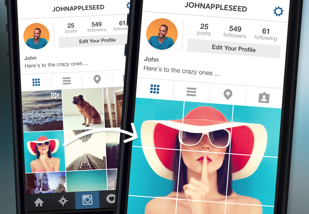
But in order to unleash this powerful visual beast, you need to get creative with that 9x3 grid. So let's dive in.
Getting to Grips with the Grid
First impressions matter: when someone arrives at your profile, your goals (at least initially) are to get them to scroll, follow, engage, and share. I am sure you can guess which ones are important in that list! What all this means is that your all-important gallery is more important than the actual posts. In other words, how it looks will determine what your patron does when they get there.
-
Leave live videos and live photos for your stories
Your grid is not the place for these. Think of your grid as a print ad: it has to be visually impactful as a whole. -
Have a goal
Are you creating your grid for a campaign? For brand awareness? Fundraising? Your goal will inform your content plan, and the images you need, so start there. -
Have a content plan
This is more than planning the images, you also need to think about hashtags. Creating a specific hashtag just for your campaign or even your brand is a great idea, and of course all the other applicable hashtags. Do this ahead of time. Not only will this will save you time, but also it will let you really come to grips on how you want your grid to look.
Pro Tip: Use Canva or a similar style app as your planner. Canva is a very easy to use (and free) graphic design app. When you get in, choose a 9x3 layout (like Instagram), upload your planned pics in the app and move them into the boxes to see how everything looks before you get to posting. This will really ensure what you are planning and what you are posting makes visual sense.
-
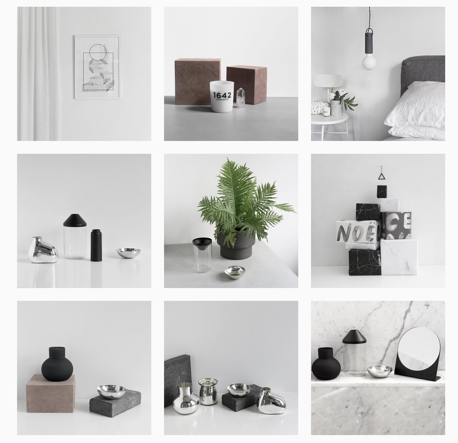
Choose a style!
There plenty of different ways you can go with this in terms of style. For arts organisations, consider you might want to consider your branding and colour palette as the basis of your style. This will help your grid look and feel cohesive. This may feel restrictive, but if you are after a grid that is focused on brand awareness, then certainly consistent styling is important. If that seems too far, at least use the same filter for all your photos. Another option to consider is to switch up the styling depending on what you are promoting - but be consistent with that as well! -
Layout
If you stick with a specific style and do nothing else, to your grid layout - your Instagram profile will definitely be a step above. But if you want to go next level with your grid you need to get creative with your layout. Checkerboard, flatlay, horizontal or vertical lines - we'll demystify these layouts below. -
Get some tools
Scheduling tools, pic splitters and more will help you get to Instagram nirvana. For some of the layouts below, you need to be able to instantly post three images at the same time to get the right effect. A scheduler can help you do that. For other layouts, you need to be able to break up an image. Breaking up an image can also allow you to create teaser or puzzle campaigns that are great fun when you have a big reveal for your audiences. Pic splitter apps such as 9Cut, Giant Square Photo Split or 9Square can all help split your images quickly. -
Edit your photos - or at least definitely look at them!
It goes without saying that you really need to check the images you are using before you post. And if you can, edit them in a photo editor of your choice to get them exactly as you need them. -
Remember how insta posts.
If you want to build the final image correctly - like in a teaser campaign - you’ve got to post the images in the right order. Assuming you’ve split the image into a 3×3 grid, you’d upload the pictures to Instagram in this order (images should be posted from the bottom right to the top left).
-
Bottom right
-
Bottom middle
-
Bottom left
-
Center right
-
Center middle
-
Center left
-
Top right
-
Top middle
-
Top left
Since Insta is all about images we’re going to shut up now and show you what you can really do with Instagram layouts!
Squares Layout
This is your basic layout - post a photo one at a time. This is absolutely fine to use, as a base for your grid. If you use this layout, definitely consider your colours and filters and be consistent. Stick to 1 or 2 base colours for the biggest impact.
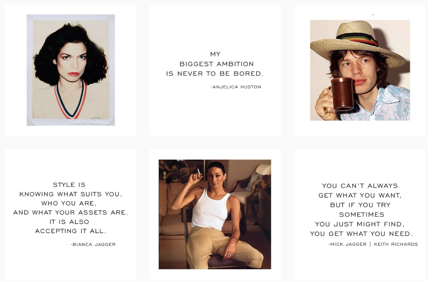
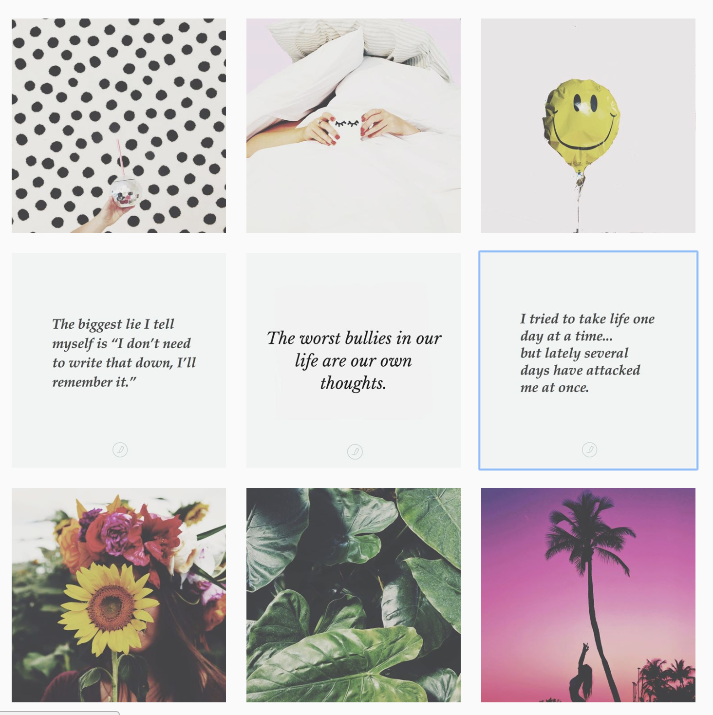
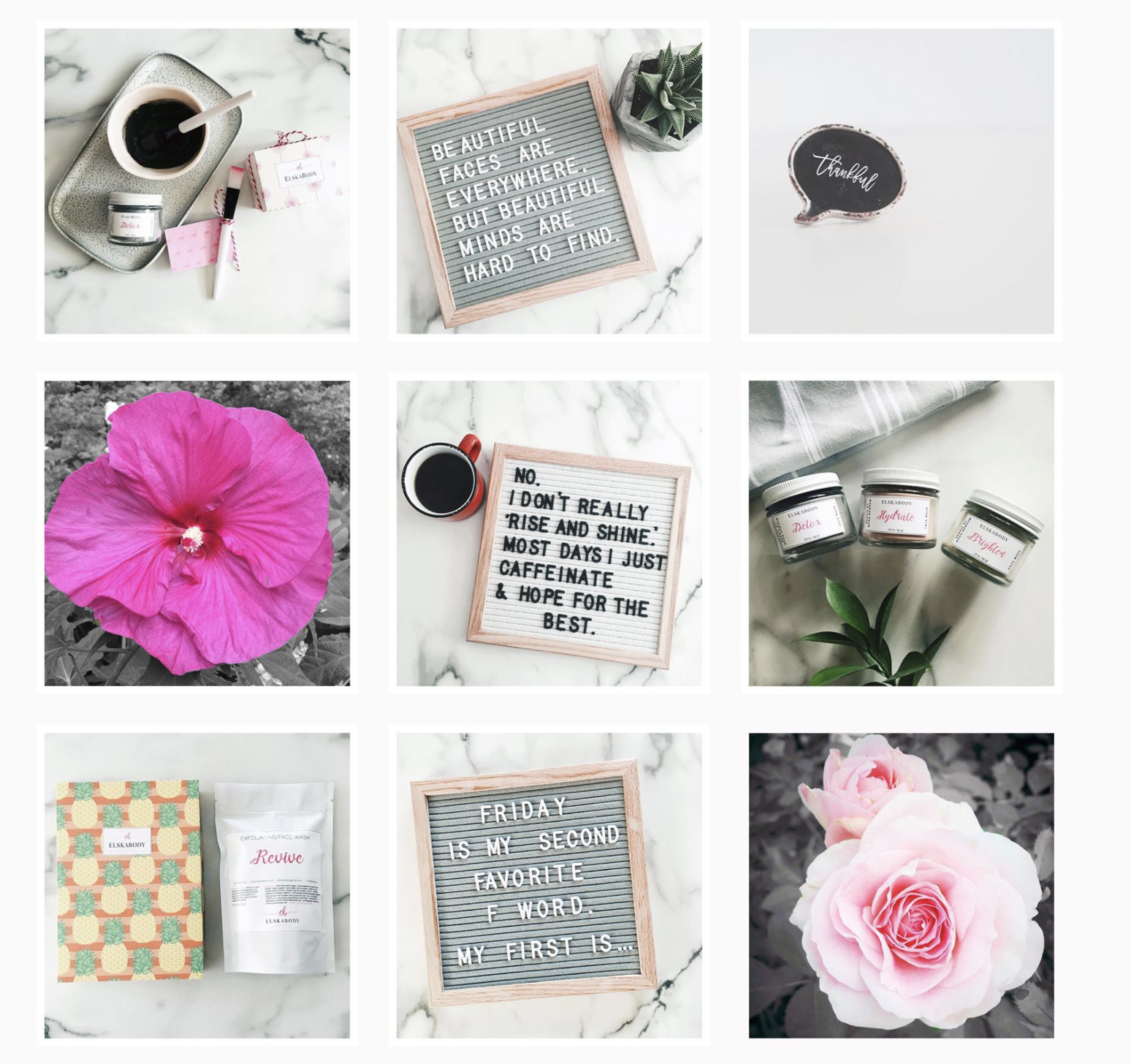
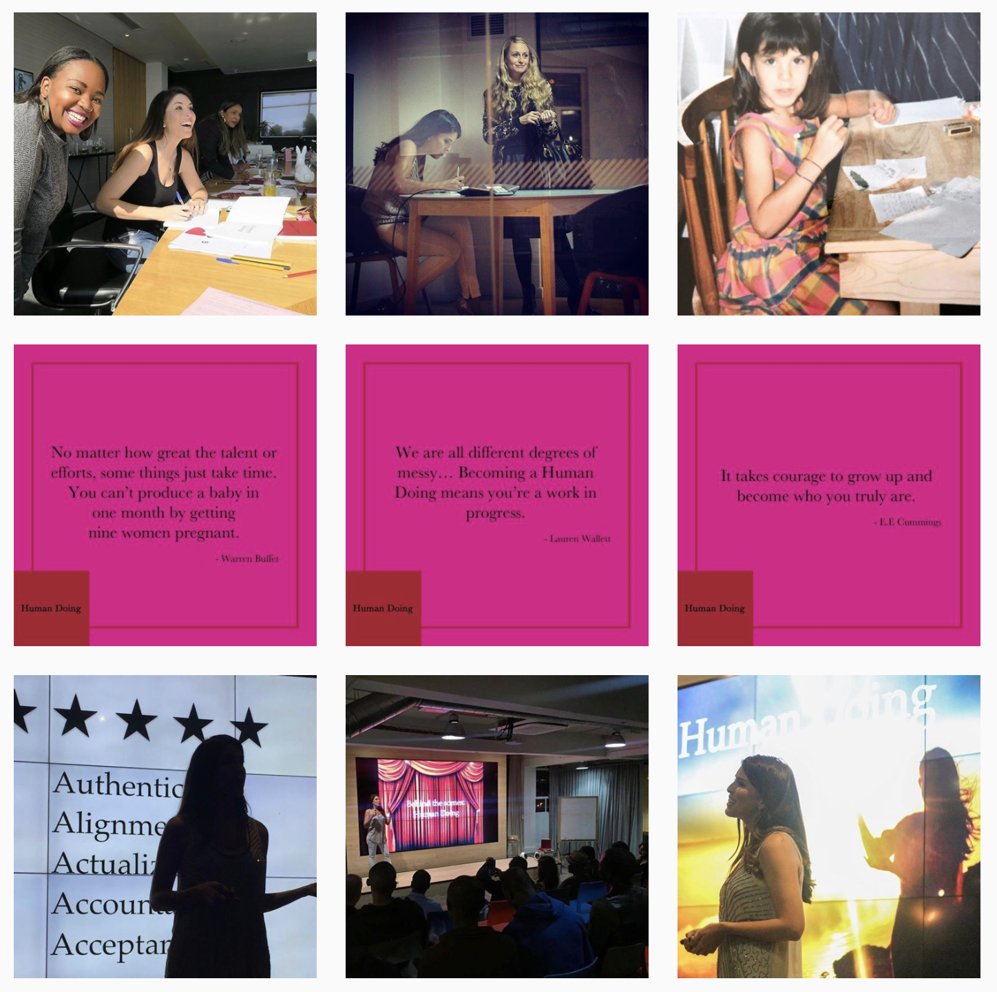
Checkerboard Feed
Just a checkerboard this layout makes use of alternating. Think 2 colours or 2 types of posts. Photo/quote/photo/quote etc. is probably a style you are familiar with. Again remember to keep it consistent with the colouring and styling.
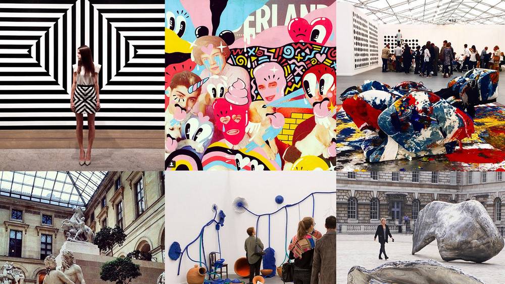
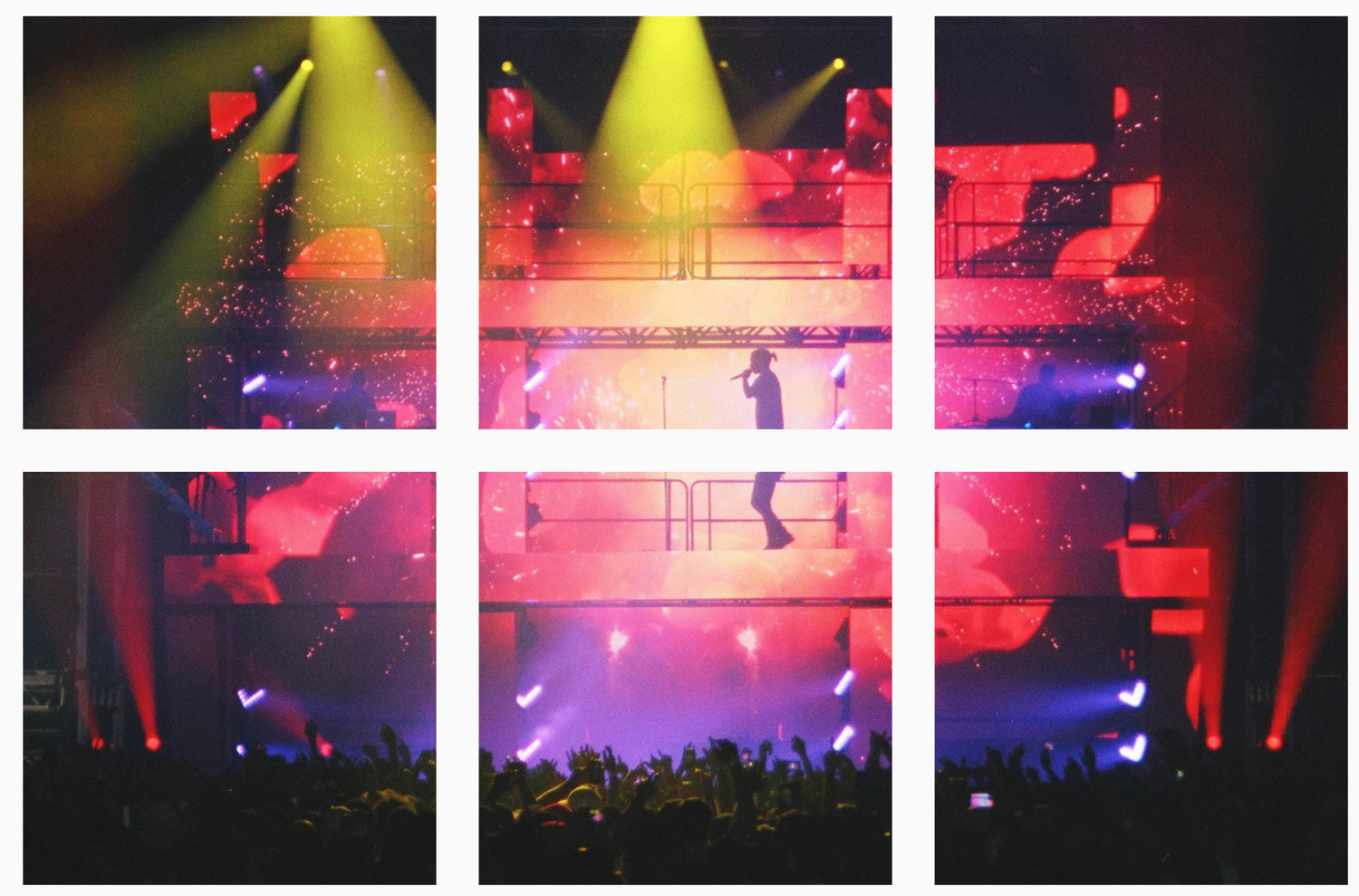
Row by Row Layout
If you have a story to tell or something big to reveal - this is the layout for you. Each row tells a story. The trick here is you need to post three images at the same time. Each row needs to visually be cohesive - even if the row before it is something different.
Vertical Lines Feed
For this one, you are doing a big quote in the middle of your grid - or something else eye catching while the other squares are similar in style.
Diagonal Grid
Diagonal lines - take a look!
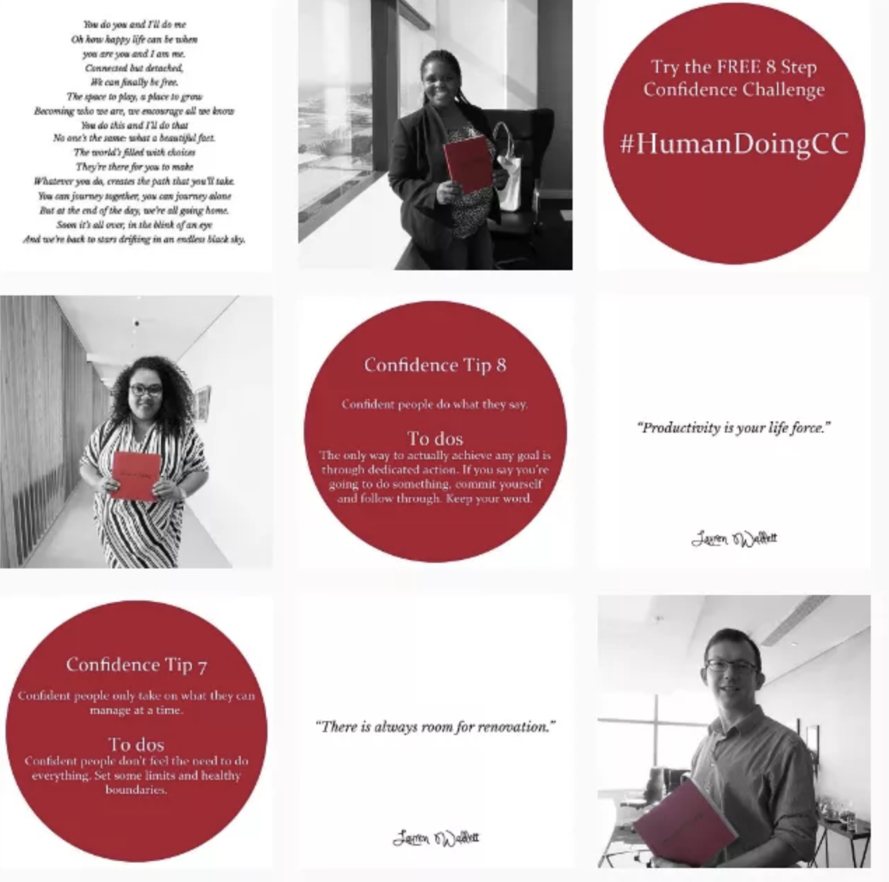
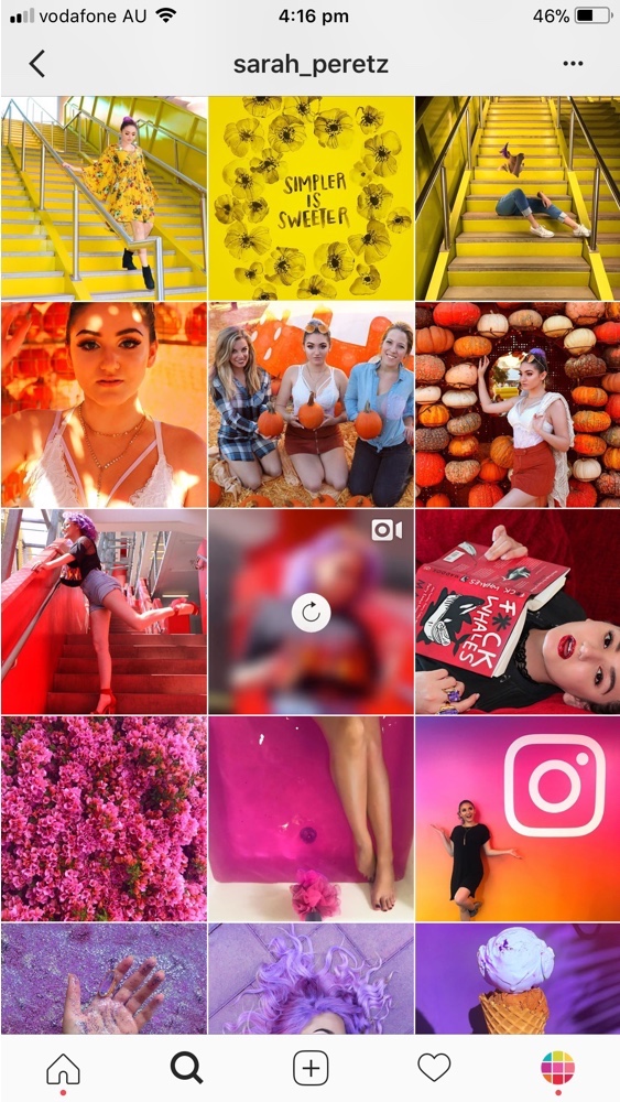
Rainbow Layout
With this layout each row is something different. This gives you the ability to mix styles filters etc - but remember to be consistent on each line.
You can also make your grid a single colour tone! Especially great if you have some new branding to share!
Mixed Feed
Remember you don't have to stick your layout forever, change it up. You can use a variety of layouts on your feed.
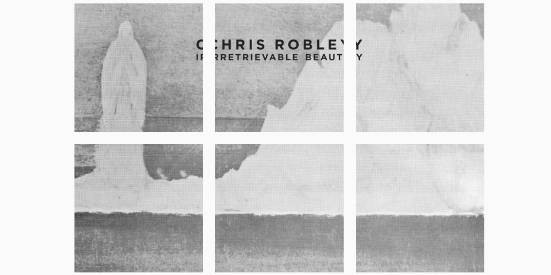
Split Pic Layout
This is where you take one image and split for your 9x3 grid. This one is a great one to use for a big reveal or creating suspense before a show or onsale.
Hopefully, that will get you thinking about your Instagram feed and how you can use it a bit more effectively! Enjoy experimenting!